
A “Visual Identity” Challenge
Create a Unique Viewer Response.
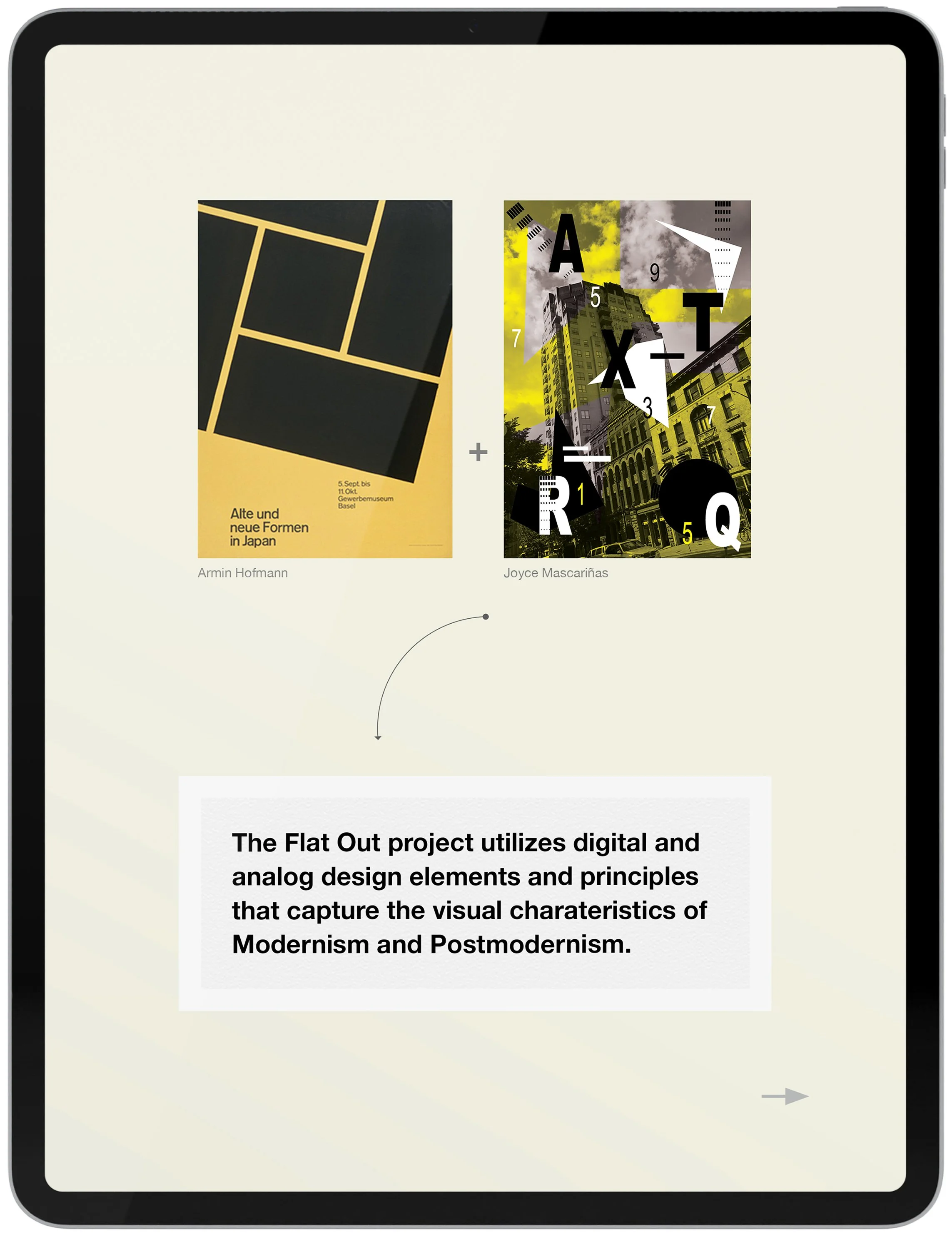
The strength of a visual identity system is its capacity to create consistency across all branding efforts. By ensuring that all components of Flat Out's visual system are similar, they collectively evoke a unique and memorable brand. Each interaction with the audience becomes more impactful because they convey the same essential messages and visual cues with every contact.

The “Brand Elements” Project
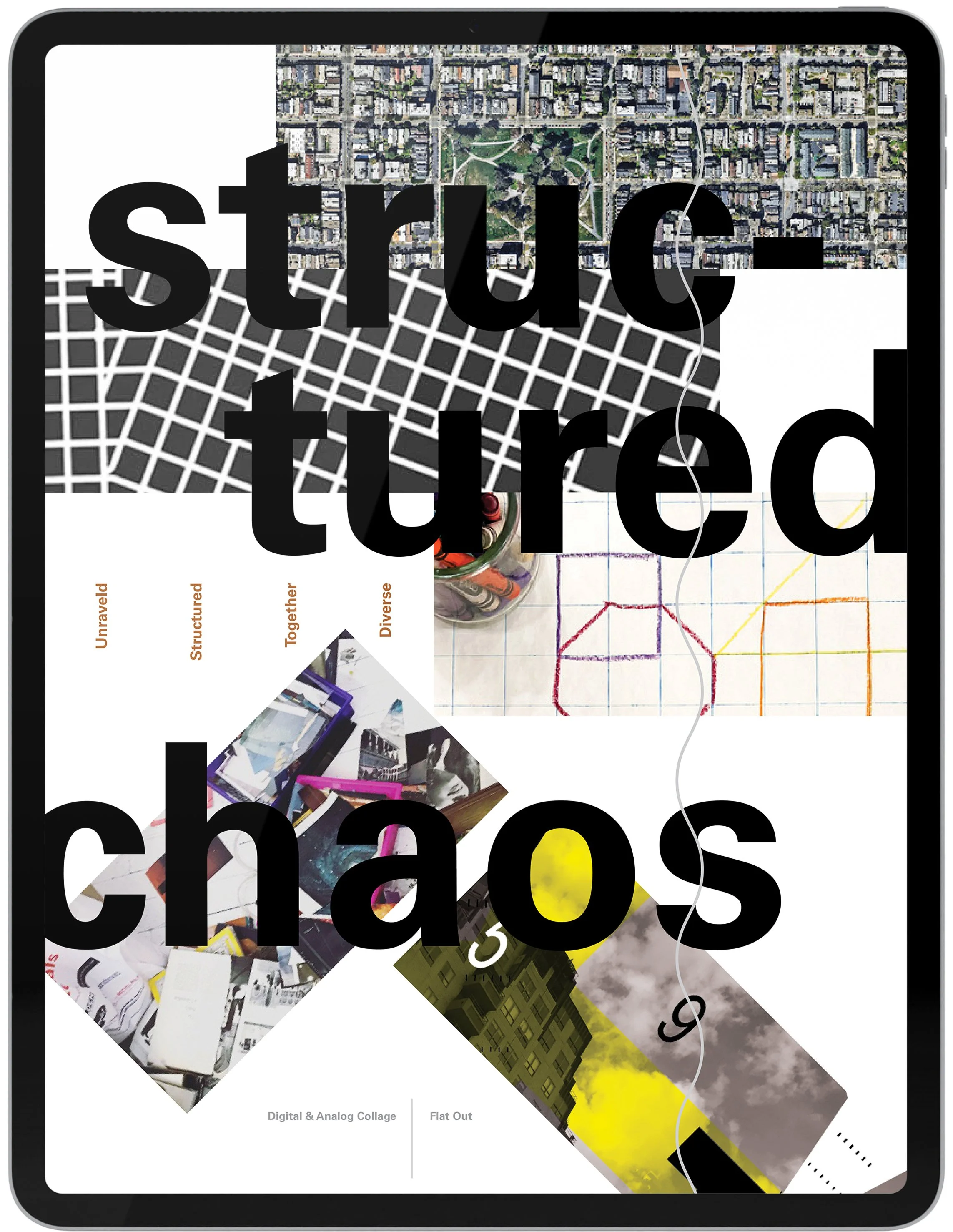
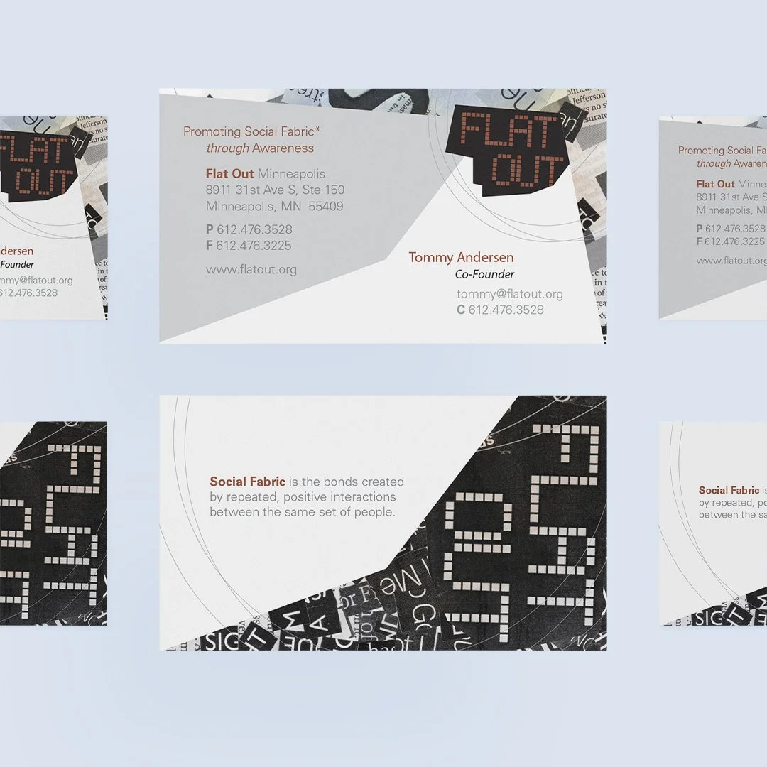
Flat Out explores the disintegration of our social fabric, which refers to the connections formed through consistent, positive interactions among the same group of people. The typographic grid symbolizes how our society organizes the spaces we inhabit, similar to the gridded layout of our cities, which contributes to the dismantling of our social bonds.
The “Namestyle” Project
Flat Out explores the disintegration of our social fabric, which refers to the connections formed through consistent, positive interactions among the same group of people. The typographic grid symbolizes how our society organizes the spaces we inhabit, similar to the gridded layout of our cities, which contributes to the dismantling of our social bonds.

The “Stationery” Project
In visual identity projects, starting with a test project like stationery is effective. It allows designers to explore key elements such as color schemes, typography, and logo placement. This focused approach helps refine the brand identity and provides insights into its resonance with the target audience before tackling more complex applications.


The “Poster” Projects
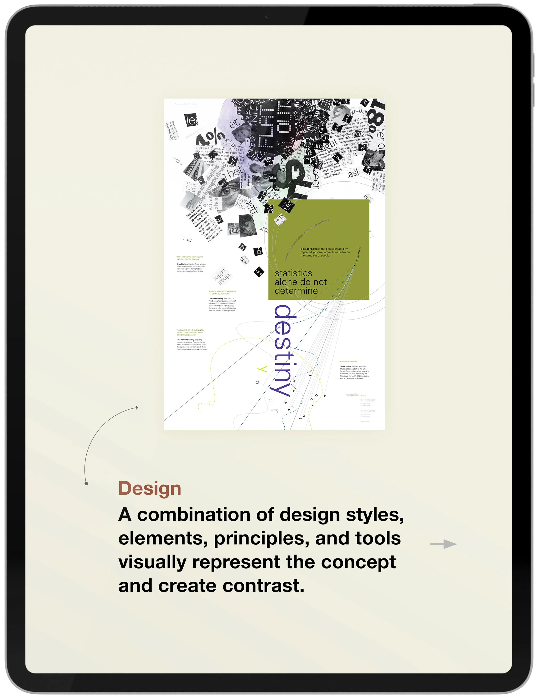
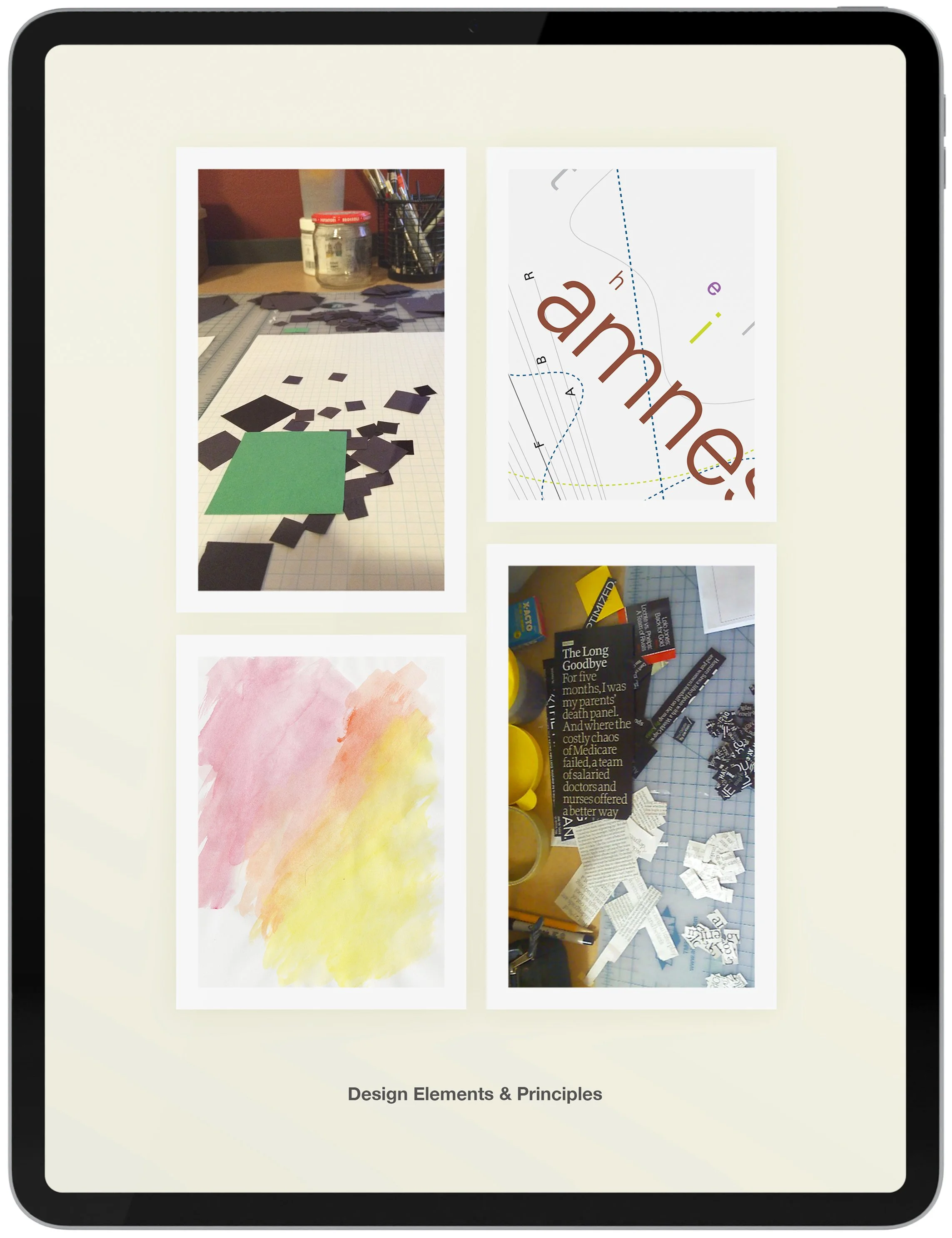
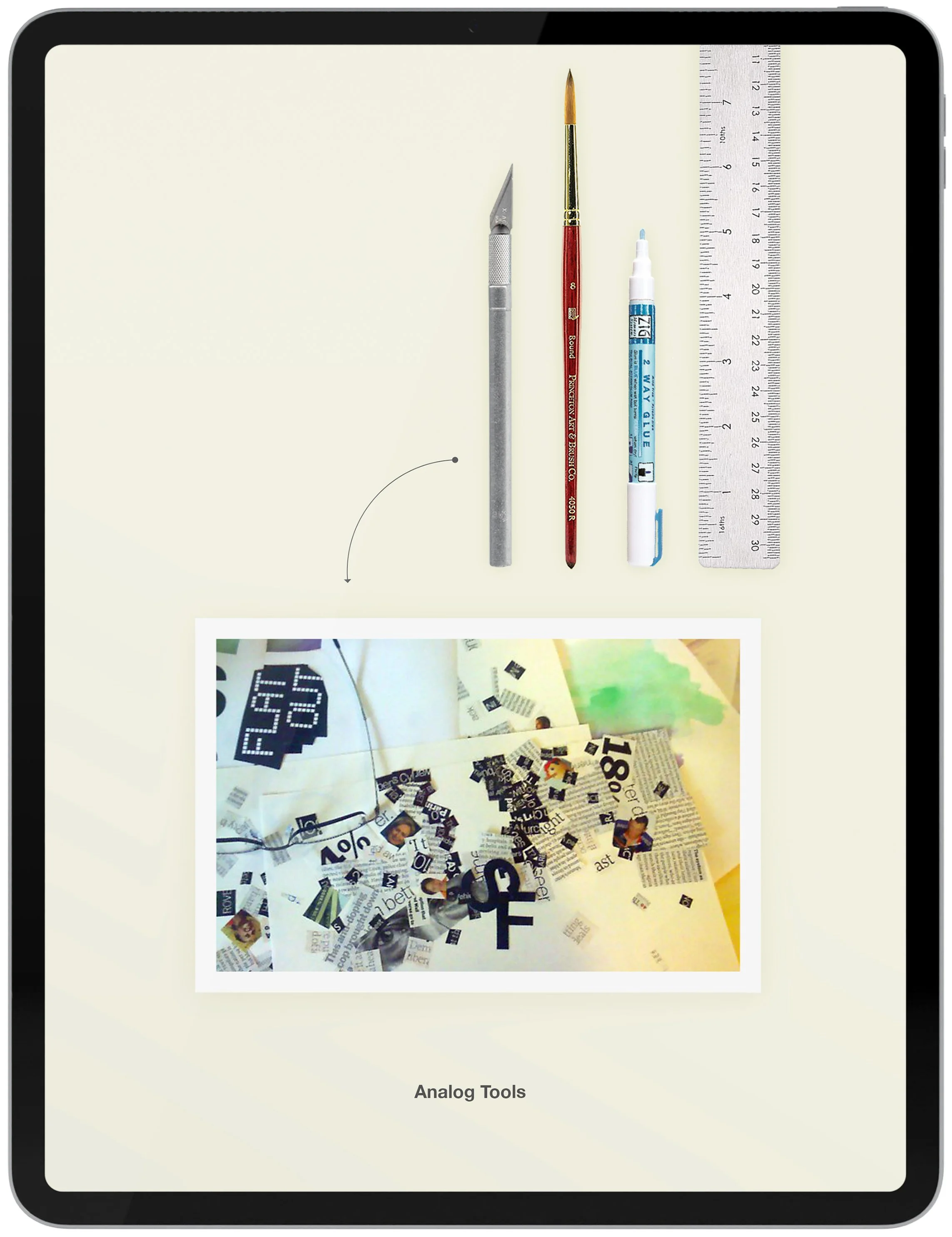
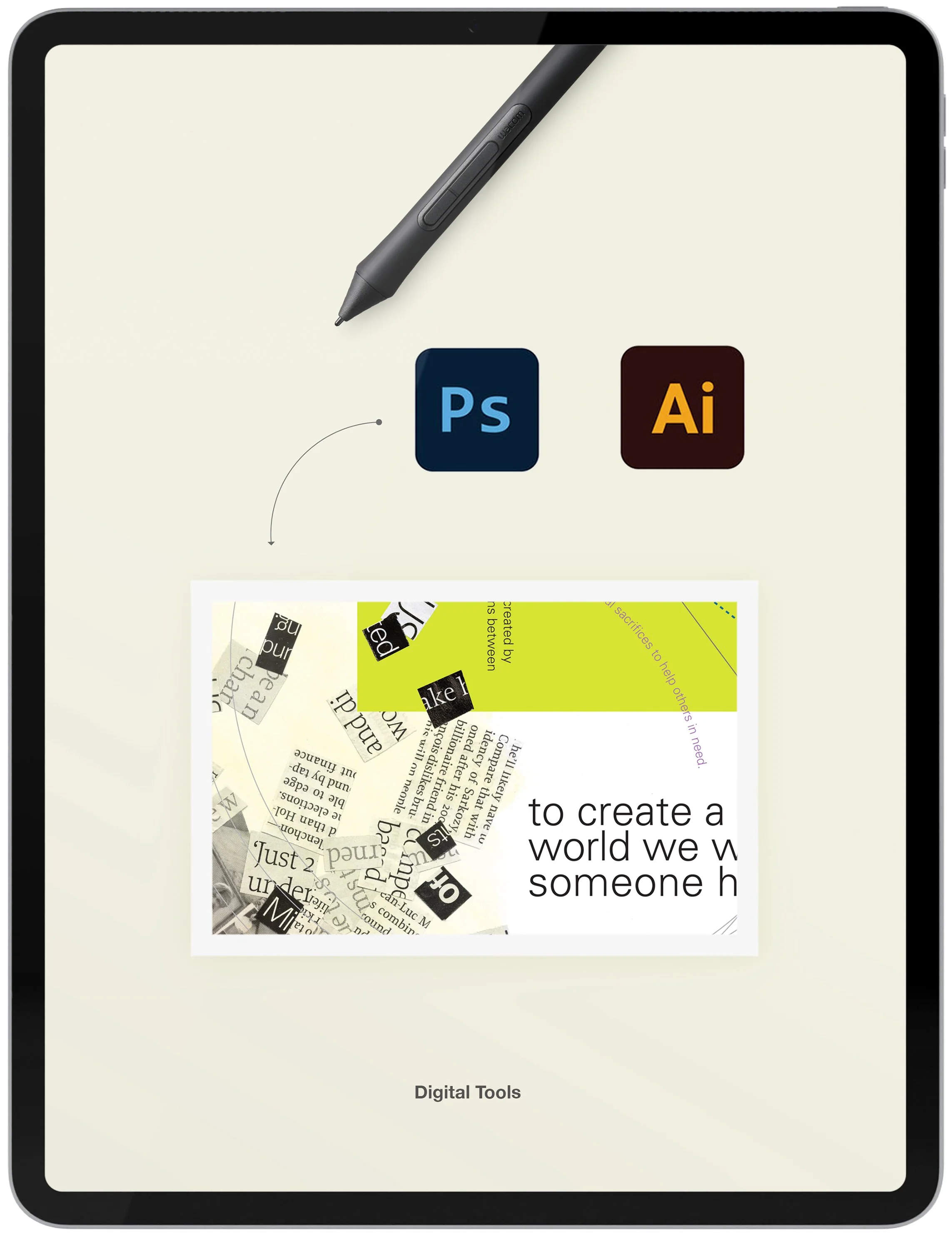
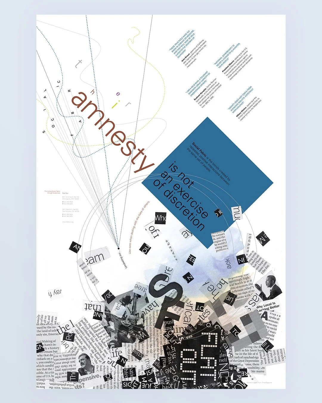
Every tactile element of the Flat Out posters was handmade, either cut from magazines or crafted from paper. Organizing and determining the final arrangement of these elements took hours. The digital typography, geometric shapes, and graphic lines were designed to provide contrast with the underlying collage. Each composition was carefully assembled to enhance the poster's headline and provide visual variety.

The “Magazine” Project
The Flat Out advertorial magazine spread features a compelling blend of design elements that create contrast. By merging analog and digital aesthetics, it evokes a modern yet nostalgic feel, offering a tactile experience alongside digital precision. The interplay of layered and flat designs adds depth and interest, while a balance of open spaces invites exploration.
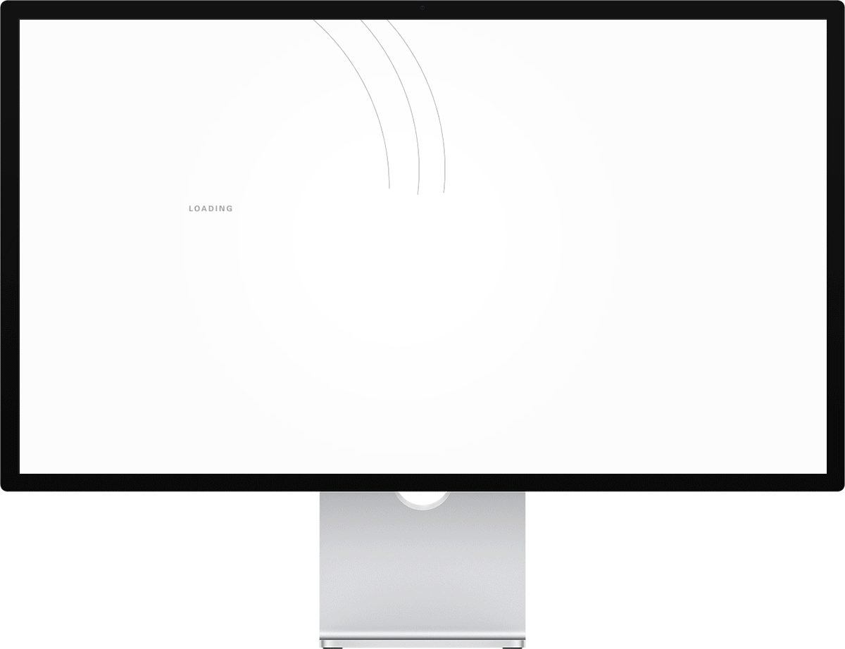
The “Website” Project
The Flat Out website emphasizes the importance of community building and volunteerism. It features a custom design that seamlessly blends form and function, allowing personality to shine through a user-friendly experience. The site showcases a seamless blend of typography and graphics, complemented by cutting-edge technology and a unique user experience.
The “Interactive Wall” Project
The Flat Out interactive wall project’s purpose is to depict how our social fabric is no longer bonded together through repeated and positive interactions. Today, it is continually attacked and torn apart by repeated negated and violent assaults from our world leaders that ultimately permit their ‘followers’ to violate basic human rights.