An “Identity Guideline” Challenge
Create a consistent brand experience.
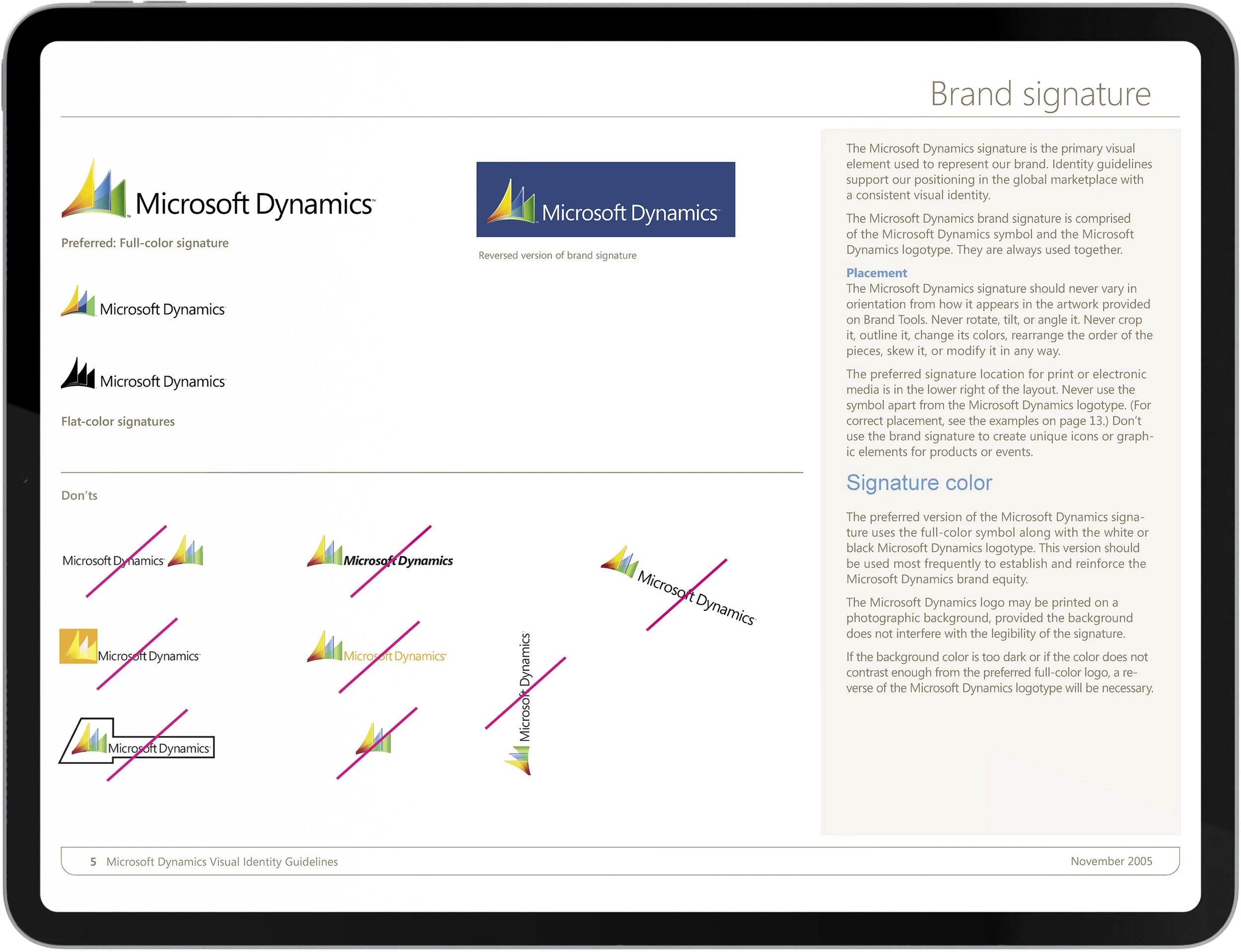
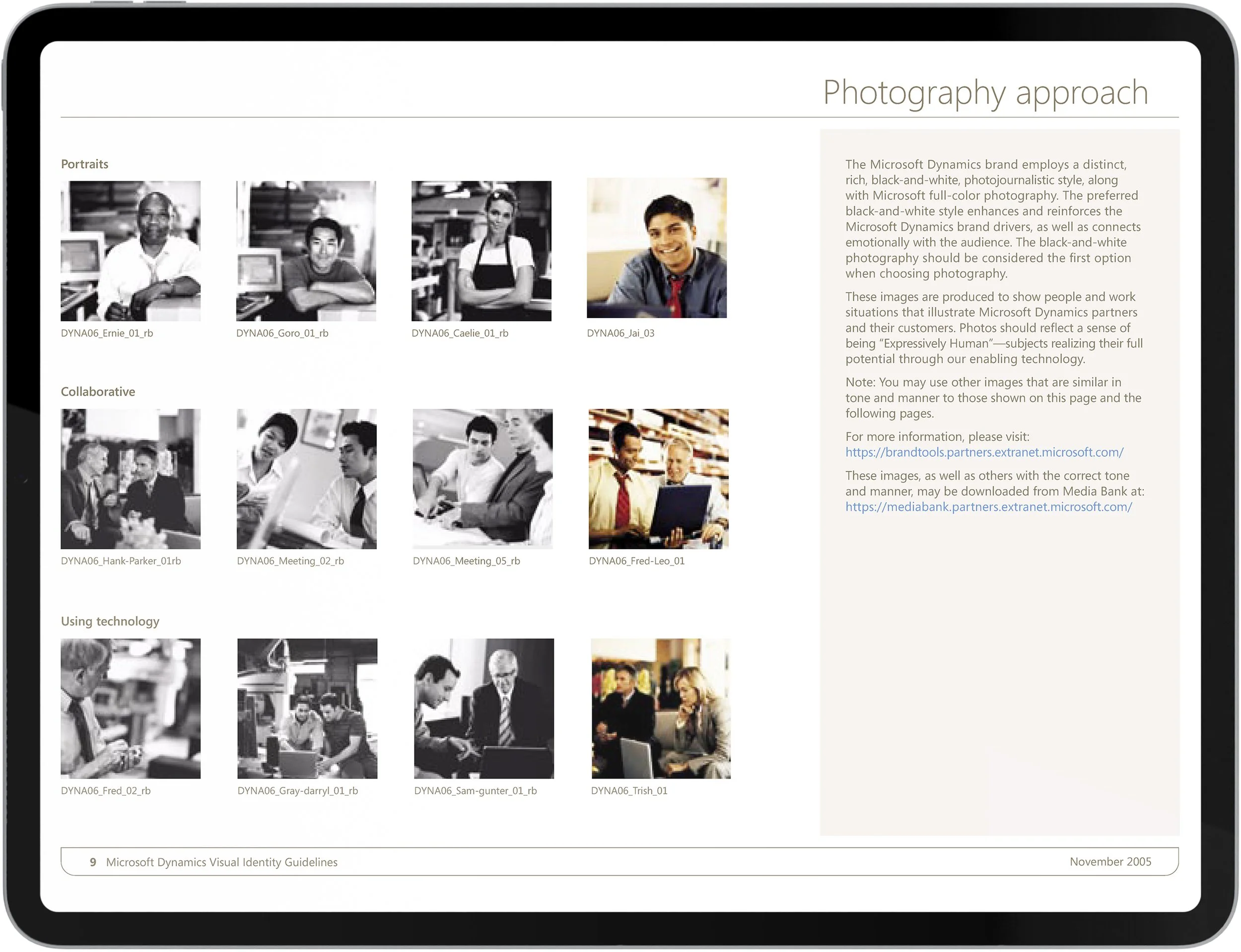
The core purpose of Microsoft Dynamics’ visual identity is to distinguish the brand, establish a strong market presence, and foster trust. It is more than just a logo or color palette — it is a unified system that visually and verbally expresses who we are and what we stand for. Applied consistently across all design applications, it becomes a powerful tool that communicates value and personality at every touchpoint.

The “Visual Guidelines” Project
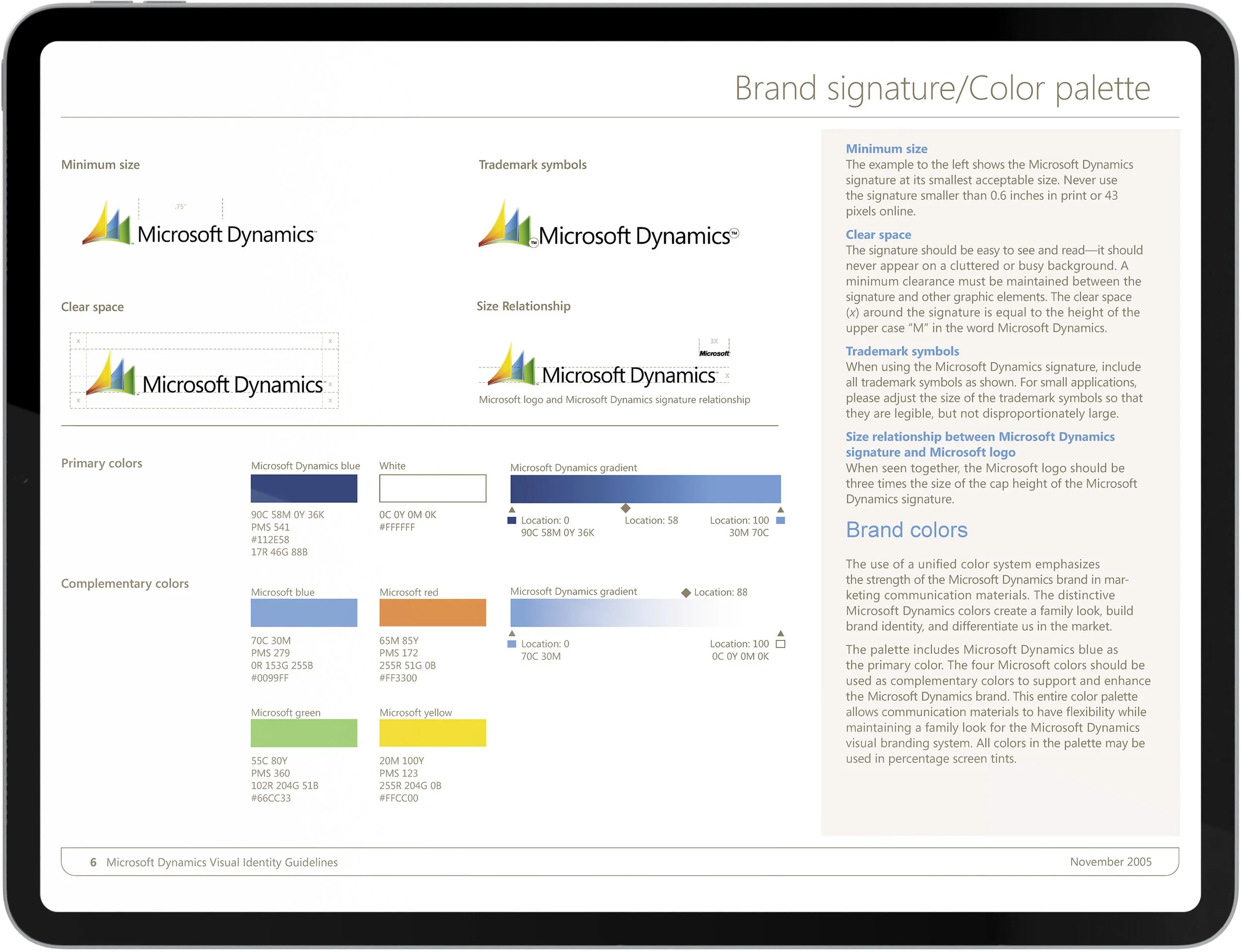
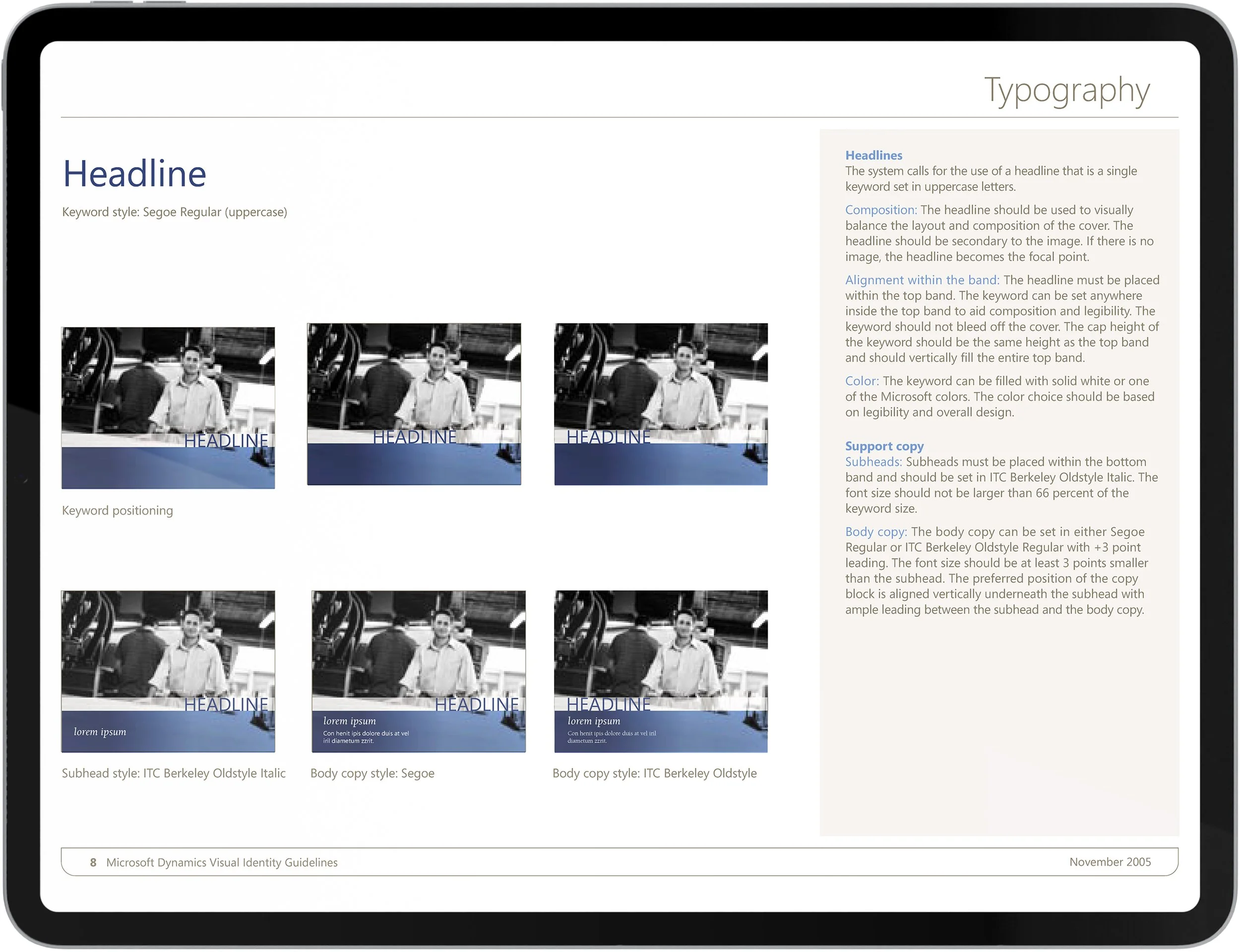
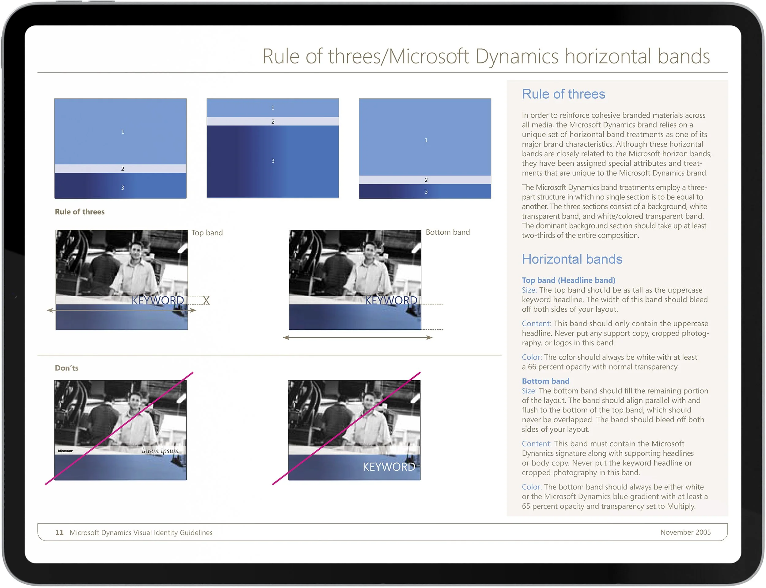
A strong visual identity supports brand recognition, reinforces credibility, and helps customers immediately identify and connect with the Dynamics ecosystem. By providing clear guidelines for the use of color, typography, imagery, graphic elements, and layout, Microsoft ensures a cohesive and memorable experience that strengthens our brand story, promotes clarity, and builds familiarity over time.

The “Brochure Systems” Project
The previous Dynamics’ sales brochures were beautifully designed, but they were inconsistent, with little content and complementary graphics to explain complex programs. While referencing the new visual guidelines, a consistent system of brochures was created to highlight different business sectors. This resulted in audience and context-specific branding materials that also created significant brand recall.


The “Academic Alliance Brochure” Project
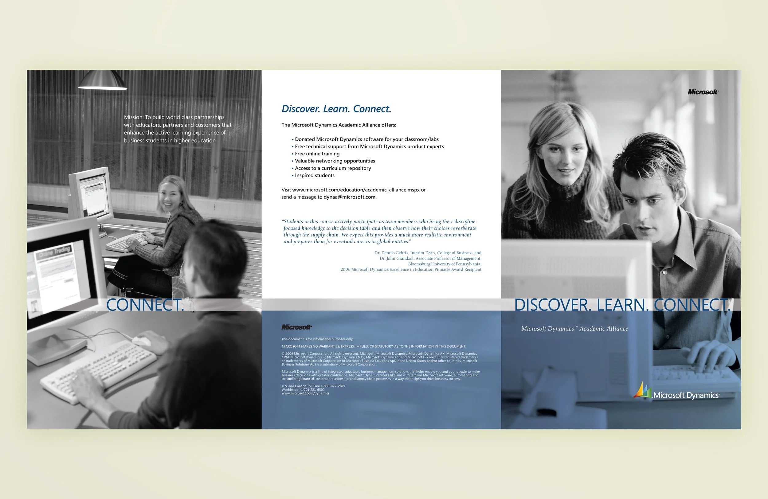
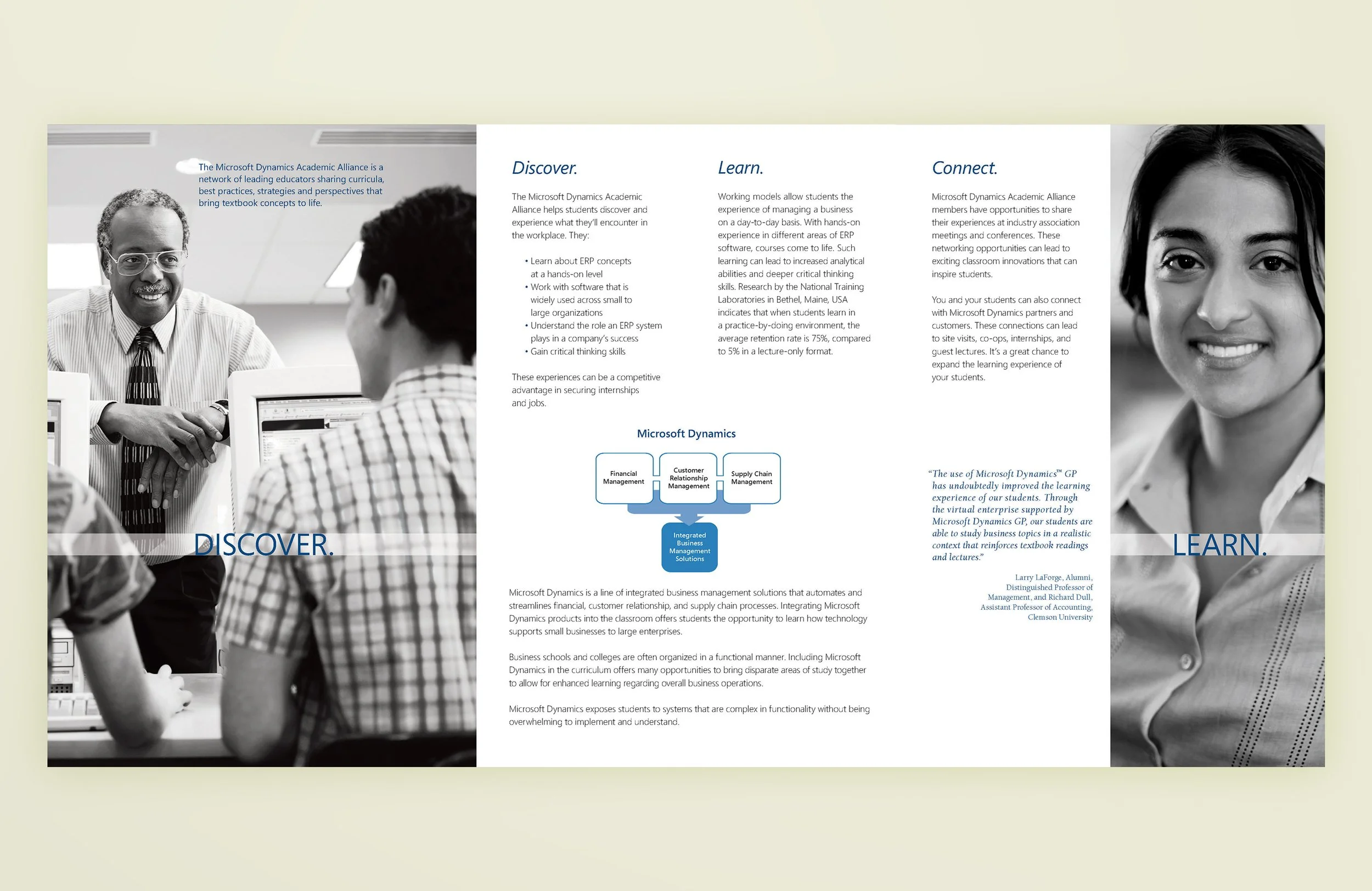
Annually, Microsoft Dynamics holds an Academic Conference that helps students discover and experience the challenges they will face and the technology they will use in the workplace. While referring to visual guidelines, photography and format were chosen that highlight the event theme. The result was an aspirational brochure and banner that appealed to students both visually and textually.

The “Academic Alliance Banner” Project
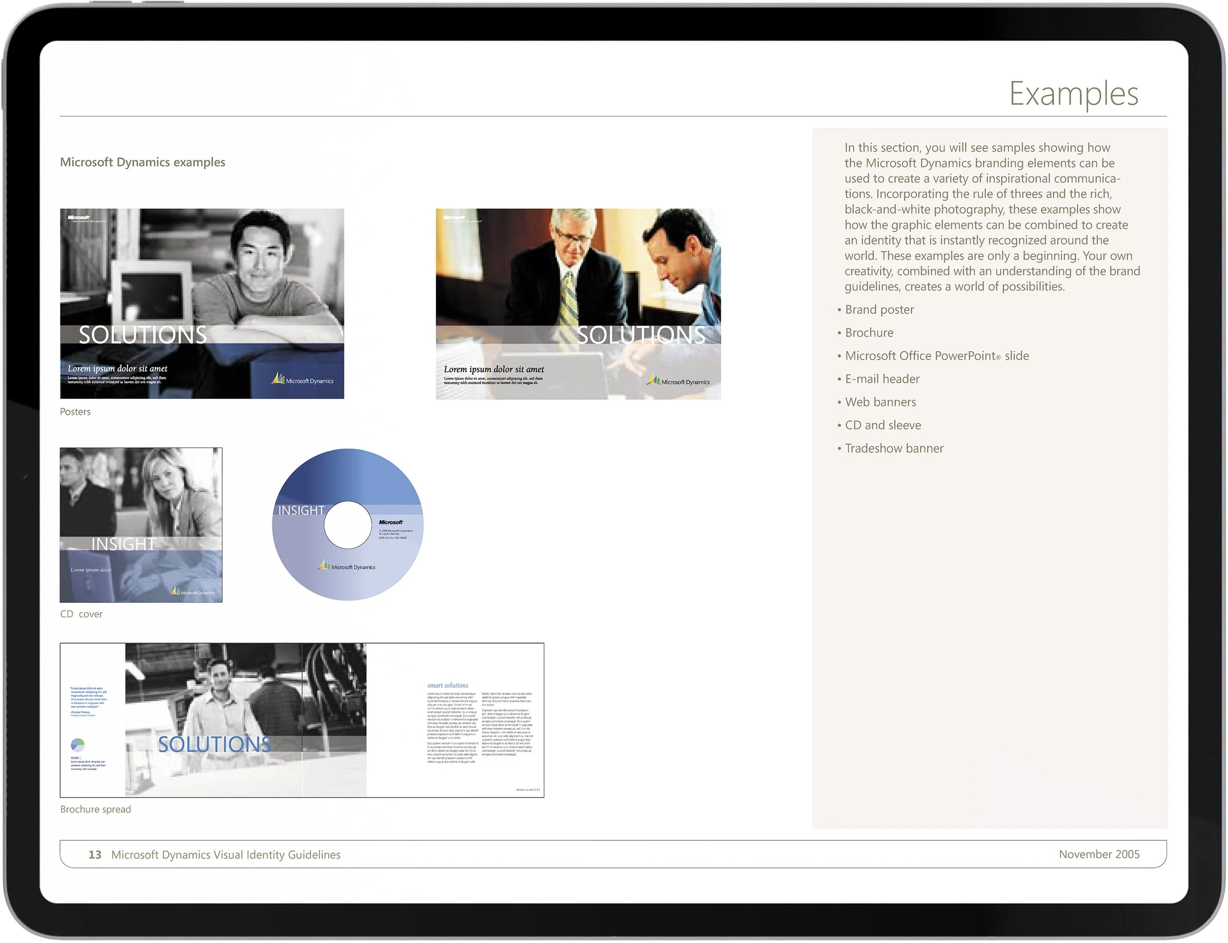
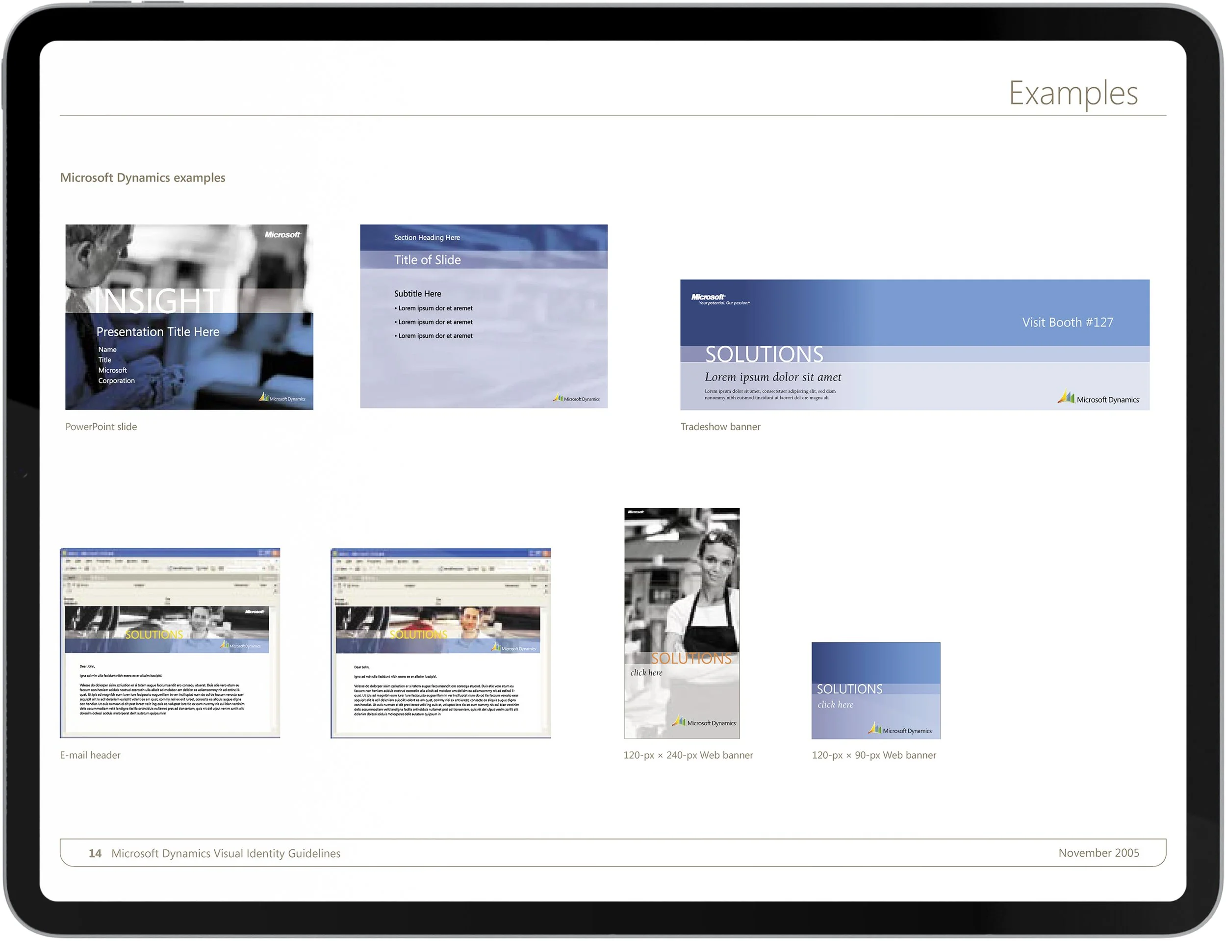
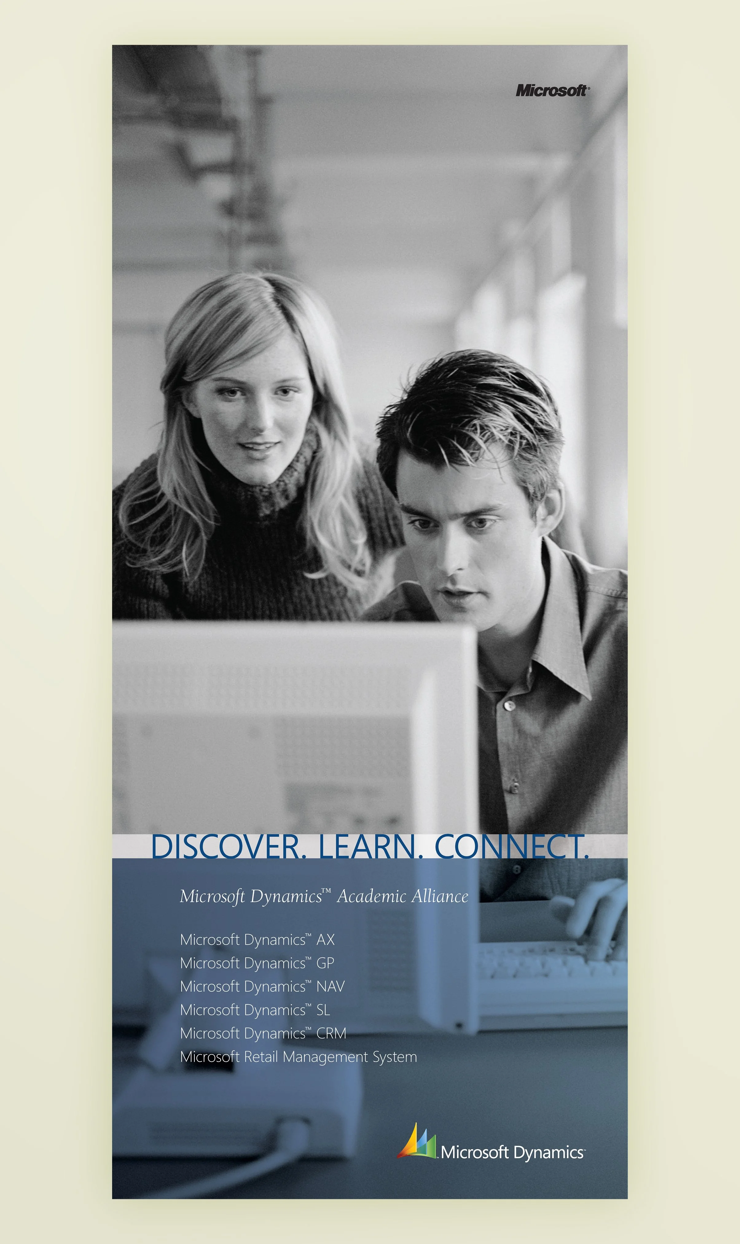
A key feature of a visual system is its flexibility, which enables it to translate to a variety of formats, sizes, and media. For example, Microsoft Dynamics needed an event banner and other event materials that complemented the brochure design. And because of the built-in flexibility of the visual guide and photography choice, the translation was seamless, guaranteeing memorable event branding.


The “Enhancements” Brochure Project
In this brochure example, balanced aspirational graphics and informational content were used for optimum informative power. Colorful and user-appropriate imagery communicates diversity, friendliness, and ability. The easy-to-follow text provides clear and accessible information for the viewer. The combination creates an enjoyable experience, with the right balance of call-to-action.


